Hi,
I've been experimenting with a customized traccar-web build (master, b35e74c) and made a few UI changes around the device card and application layout.
I wanted to share these changes with the community and see what others think. They are simply experiments and possible ideas for improving the user interface, and I'd be interested to know whether any of them could fit the direction of Traccar Web.
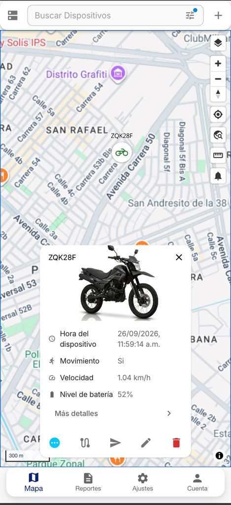
1. Per-attribute icons in the status card
The device status card displays attributes such as Speed, Odometer, Fuel level, Ignition, etc. as text rows.
I experimented with adding a small icon next to each attribute label, using an attribute-key → Material icon mapping.
The implementation uses a new file:
src/common/attributes/positionAttributeIcons.js
It currently maps around 90 position attribute keys to icons, including speed, course, altitude, battery, charge, ignition, odometer, trip, coolant/engine temperature, heart rate, GPS satellites, HDOP/VDOP, VIN, driver, geofence, archive, image/video/audio, and others.
In StatusCard.jsx, StatusRow receives the attribute key and displays the corresponding icon before the label.
Some considerations:
- Unknown or custom attributes continue to work as before; they simply don't display an icon.
- No additional translation keys are required.
- Icons use
fontSize="inherit" so the existing row density and alignment are preserved.
I found that this makes the different types of information easier to scan visually, especially when a device has many attributes.
2. Making "Show details" more clearly interactive
I also experimented with changing the "Show details" link at the bottom of the card into a full-width button.
For example:
<Button
  className={classes.detailsButton}
  component={RouterLink}
  to={`/position/${position.id}`}
  endIcon={<ChevronRightIcon className={classes.detailsIcon} />}
>
  {t('sharedShowDetails')}
</Button>
The idea is to make the action more noticeable, particularly on touch devices.
The navigation behaviour remains the same because it still uses RouterLink. The main difference is the presentation:
- full card-width action
- label aligned to the left
- chevron aligned to the right
- small hover movement on the chevron
3. Rounded corners, typography and floating bottom navigation
The third experiment is more of a visual/theme proposal.
I experimented with:
- a 14px radius for larger surfaces
- a 10px radius for controls
- softer card shadows
- Inter typography
- a floating bottom navigation bar with all four corners visible
For this experiment I used Traccar's OverrideFileFilter by bind-mounting /opt/traccar/override, so no rebuild was required.
There were a couple of interesting implementation details with the bottom navigation.
The component uses:
<Paper square elevation={3}>
so MUI applies a square border radius. Simply overriding .MuiPaper-root wasn't sufficient because the BottomNavigation component also paints its own background.
Making .MuiBottomNavigation-root transparent allowed the rounded corners of the underlying Paper to become visible.
I also targeted the Paper structurally with:
:has(> .MuiBottomNavigation-root)
rather than relying on generated/hashed class names.
However, this approach depends on MUI internal class names and :has(), and may require changes with a future MUI major version. It can also interact with the existing colorPrimary / colorSecondary server attributes.
For that reason, I see this mainly as a visual experiment. If a softer or more rounded visual style is something the project might consider in the future, perhaps implementing it through the theme (for example AppThemeProvider / theme.shape.borderRadius) could be a more maintainable approach.
Overall, these are just some ideas I experimented with while customizing my local Traccar Web installation.
I'd be interested to hear what the community and maintainers think, and whether any of these ideas could be useful as possible future UI improvements for Traccar Web.
Thanks for taking a look.

Hi,
I've been experimenting with a customized
traccar-webbuild (master, b35e74c) and made a few UI changes around the device card and application layout.I wanted to share these changes with the community and see what others think. They are simply experiments and possible ideas for improving the user interface, and I'd be interested to know whether any of them could fit the direction of Traccar Web.
1. Per-attribute icons in the status card
The device status card displays attributes such as Speed, Odometer, Fuel level, Ignition, etc. as text rows.
I experimented with adding a small icon next to each attribute label, using an attribute-key → Material icon mapping.
The implementation uses a new file:
src/common/attributes/positionAttributeIcons.jsIt currently maps around 90 position attribute keys to icons, including speed, course, altitude, battery, charge, ignition, odometer, trip, coolant/engine temperature, heart rate, GPS satellites, HDOP/VDOP, VIN, driver, geofence, archive, image/video/audio, and others.
In
StatusCard.jsx,StatusRowreceives the attribute key and displays the corresponding icon before the label.Some considerations:
fontSize="inherit"so the existing row density and alignment are preserved.I found that this makes the different types of information easier to scan visually, especially when a device has many attributes.
2. Making "Show details" more clearly interactive
I also experimented with changing the "Show details" link at the bottom of the card into a full-width button.
For example:
<Button className={classes.detailsButton} component={RouterLink} to={`/position/${position.id}`} endIcon={<ChevronRightIcon className={classes.detailsIcon} />} > {t('sharedShowDetails')} </Button>The idea is to make the action more noticeable, particularly on touch devices.
The navigation behaviour remains the same because it still uses
RouterLink. The main difference is the presentation:3. Rounded corners, typography and floating bottom navigation
The third experiment is more of a visual/theme proposal.
I experimented with:
For this experiment I used Traccar's
OverrideFileFilterby bind-mounting/opt/traccar/override, so no rebuild was required.There were a couple of interesting implementation details with the bottom navigation.
The component uses:
<Paper square elevation={3}>so MUI applies a square border radius. Simply overriding
.MuiPaper-rootwasn't sufficient because theBottomNavigationcomponent also paints its own background.Making
.MuiBottomNavigation-roottransparent allowed the rounded corners of the underlying Paper to become visible.I also targeted the Paper structurally with:
:has(> .MuiBottomNavigation-root)rather than relying on generated/hashed class names.
However, this approach depends on MUI internal class names and
:has(), and may require changes with a future MUI major version. It can also interact with the existingcolorPrimary/colorSecondaryserver attributes.For that reason, I see this mainly as a visual experiment. If a softer or more rounded visual style is something the project might consider in the future, perhaps implementing it through the theme (for example
AppThemeProvider/theme.shape.borderRadius) could be a more maintainable approach.Overall, these are just some ideas I experimented with while customizing my local Traccar Web installation.
I'd be interested to hear what the community and maintainers think, and whether any of these ideas could be useful as possible future UI improvements for Traccar Web.
Thanks for taking a look.